Buondì Motta
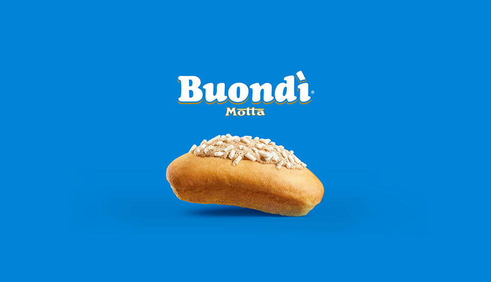
Buondì is more than a brand, since 1953 it is a legend of the Italian way of breakfasting.
Its shape and taste are unmistakable.
Restyling the packaging system of a legend is a challenge which brings great gratification. The updating must be subtle and sharp, the touch on the visual identity system has to be light and careful: the bare essential needed to bring the brand back into contemporaneity.

The logo revamp starts from the accent which stands on the product’s name as the sugar sprinkles stand on the icing. The ensemble arises, by losing the outline, to underline the idea of the lightness borne from the 22 hours of natural yeast.
The image of the Buondì about to take flight is working in the same semantic direction.

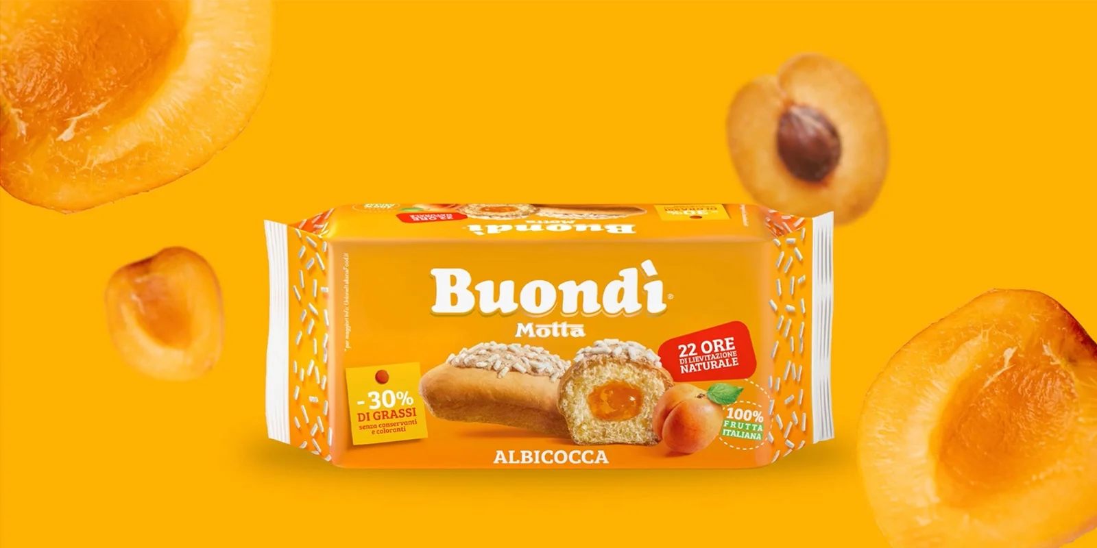
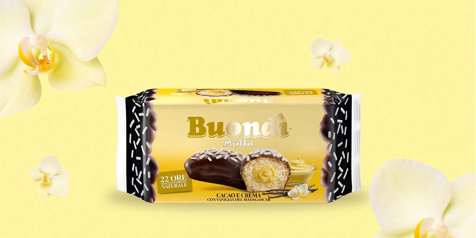
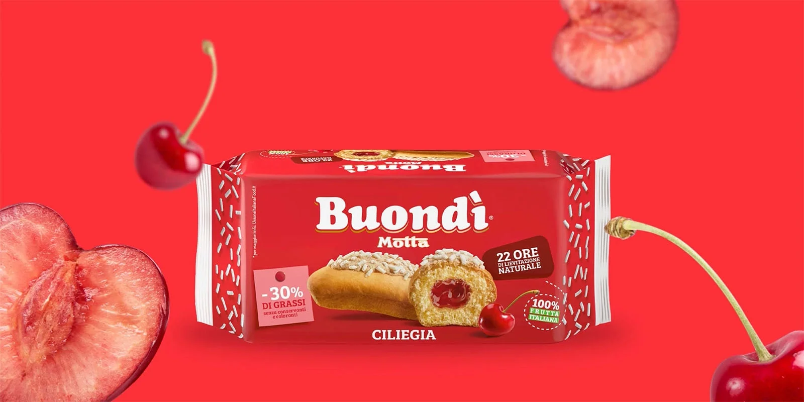
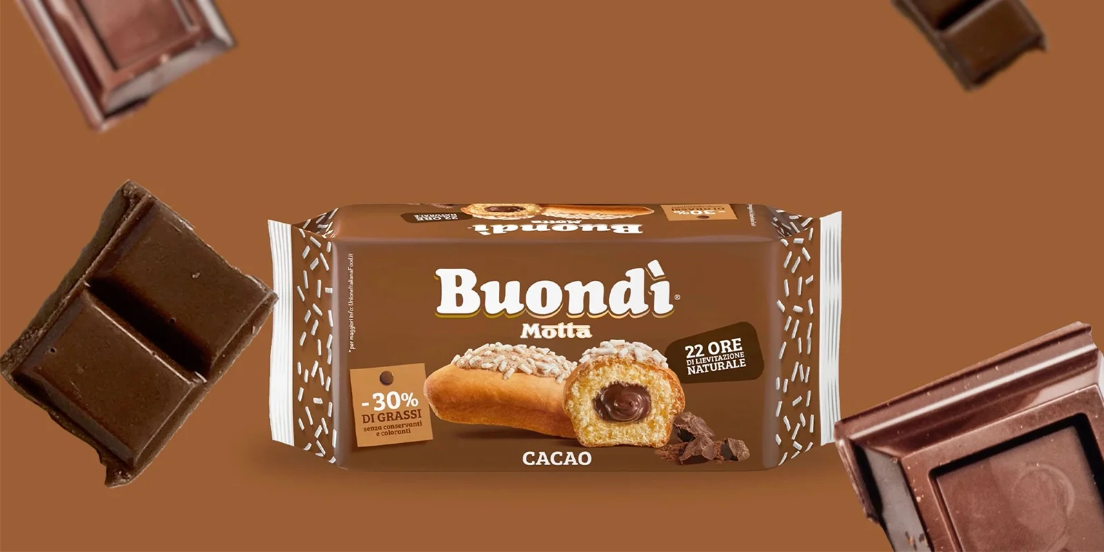
Different and lively colors, with the same depth of the Classic Buondì cyan, have been employed to increase the sorting among the 7 SKUs.
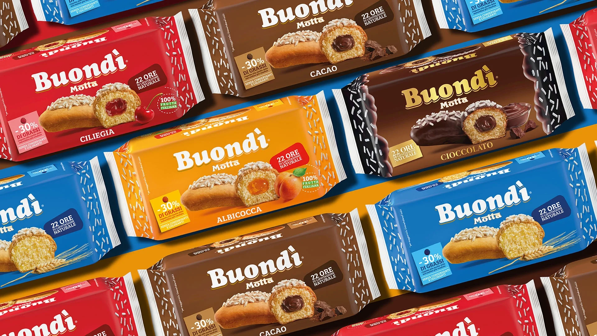
The famous sugar sprinkles, which becomes seeds and cereal flakes for the wholegrain recipe, have been moved on the packaging fins to further increase continuity in this original and creative format.