Vialetto 1893
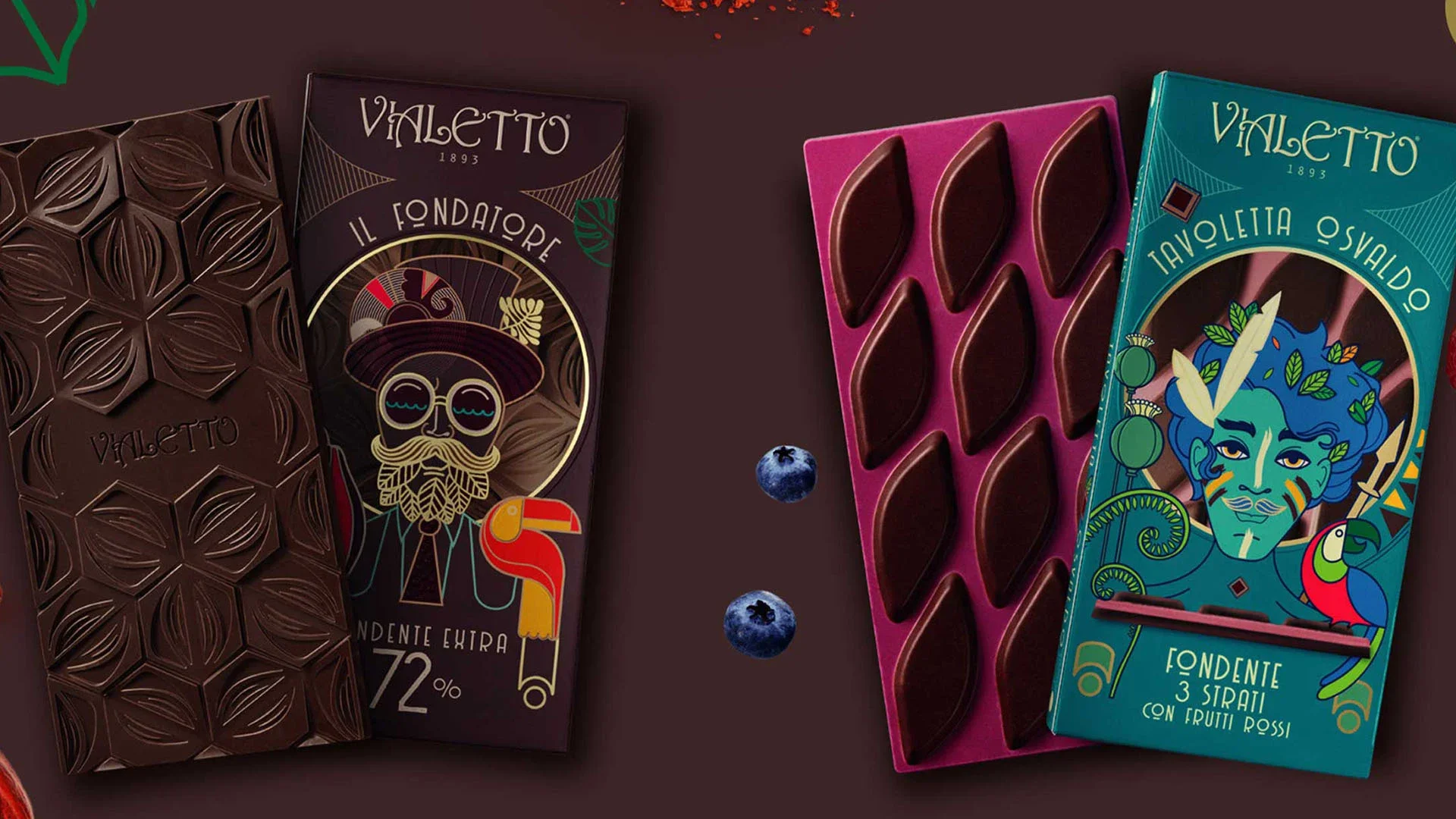
In 1893 Vialetto brand used to sign a range of patisserie and chocolaterie products that, besides quality, stood out for the refined tin boxes.
Colussi acquired and relaunched the brand dedicating it to today many chocolate lovers.
Vialetto brand identity springs out from its fin de siècle, historical heritage.
The logo and the icon are Liberty Floral Style recalling the time when chocolaterie was artisanal.
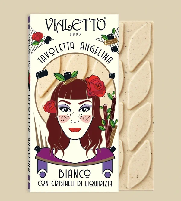
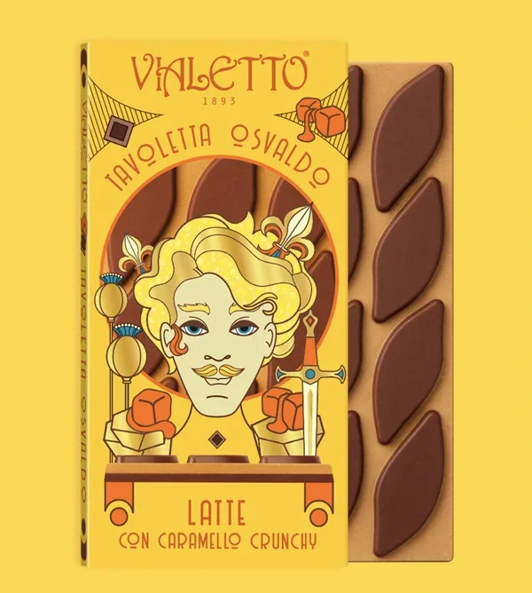
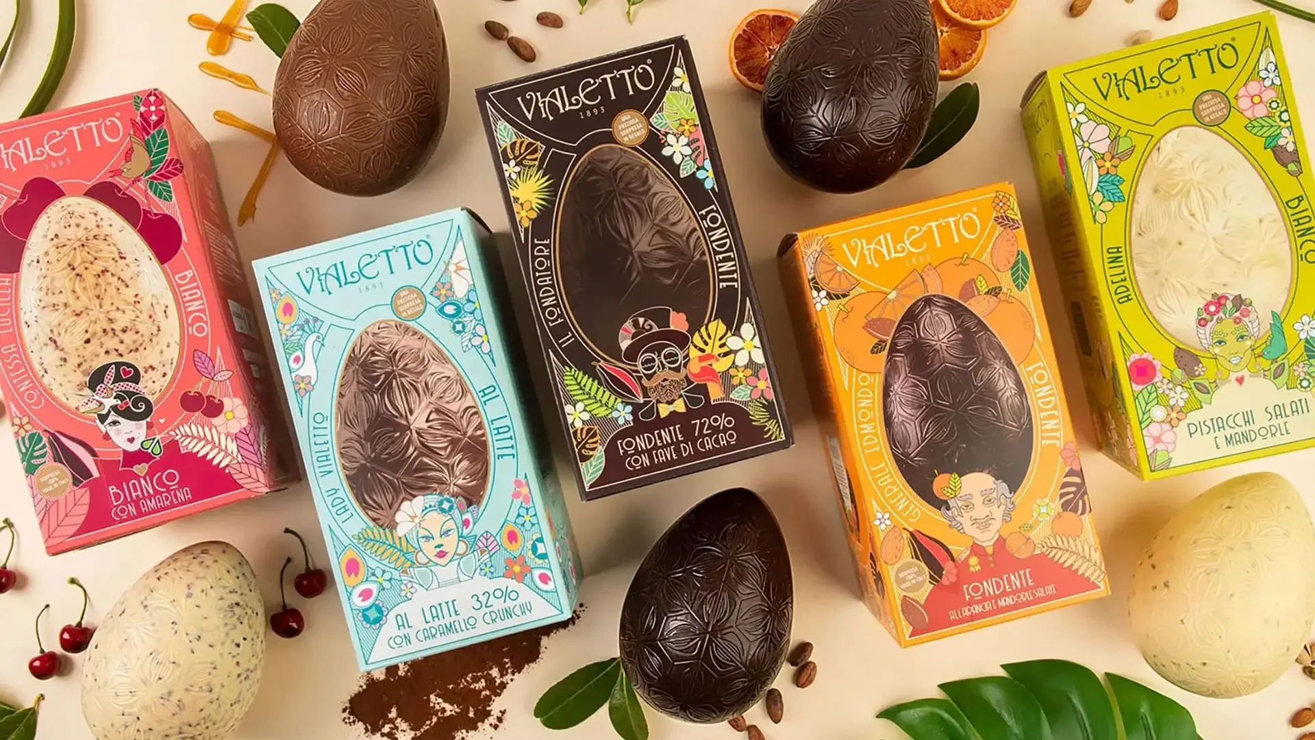
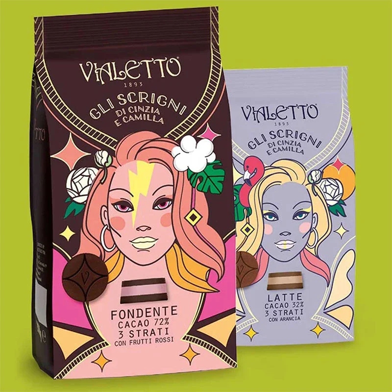
The VIS is based on the invention of a narration: a big family made of as many members as the SKUs.
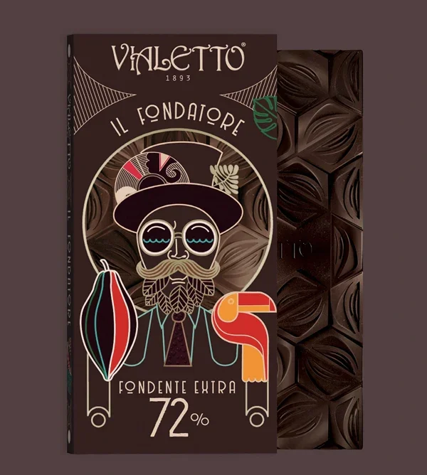

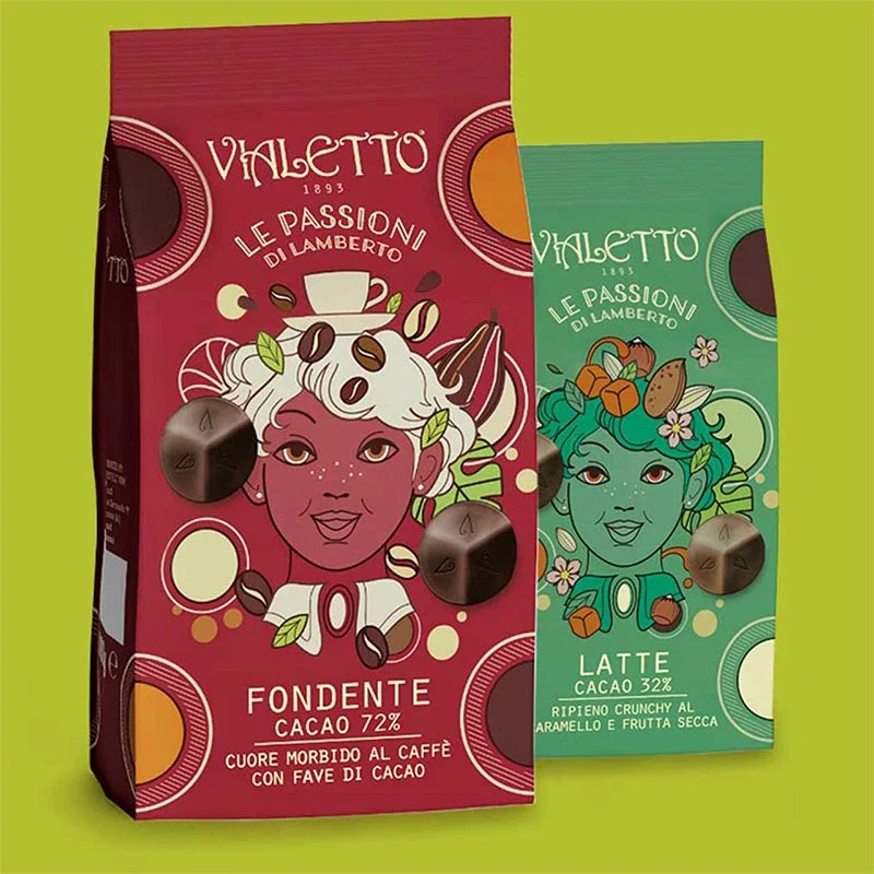
It is a wide range of recipes made combining among them different types of chocolate enriched with fine ingredients.
In the portraits of the Vialetto family members the Art Nouveau Code sees a post-modern vaguely steam-punk reinterpretation.
The idea and the style are declined on pack of the very many brand’ SKUs: chocolate bars, pralines, Easter eggs, Advent calendar and special packages for festive occasions.
The code interpretation goes beyond the packaging, reaching for the product design.
The tablets surfaces and the volumes of the eggs have been decorated in coherence with the brand narrative system.
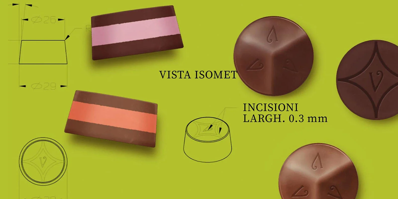
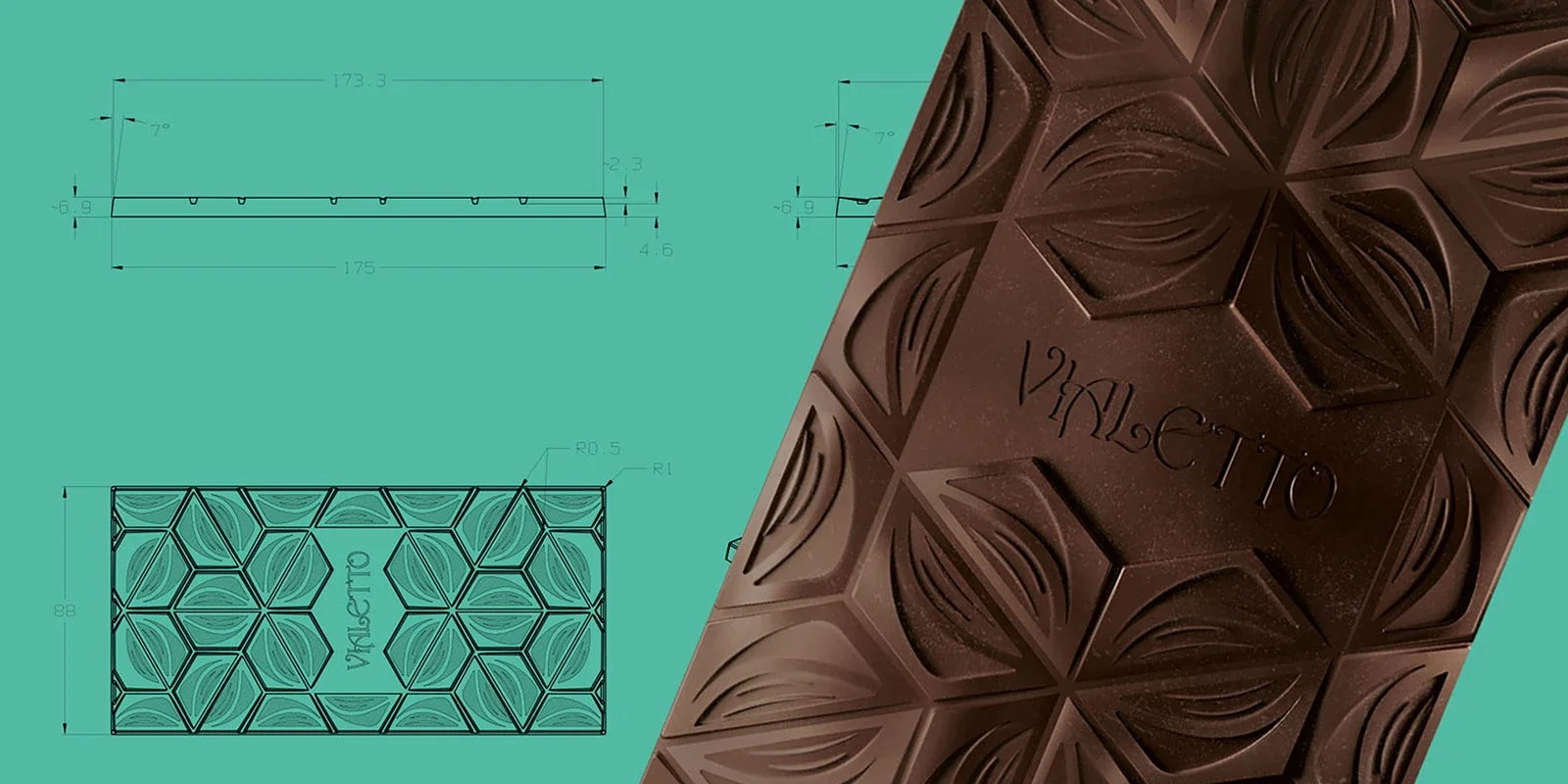
Resulting in a language which keeps telling the brand story even when the chocolate is naked.