Sanbittèr. Every color of the Happy Hour
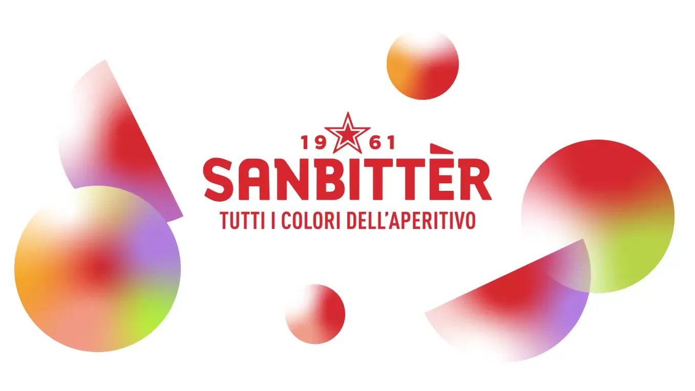
Sanbittèr, the classic, red, Italian alcohol-free aperitif shifts its marketing positioning towards a more articulated offering consisting of new flavors and colors, and transforms its claim into The Many Colors of the Aperitif.
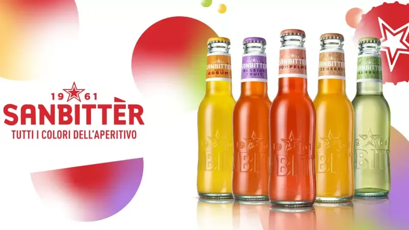
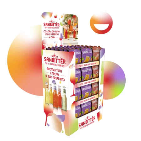
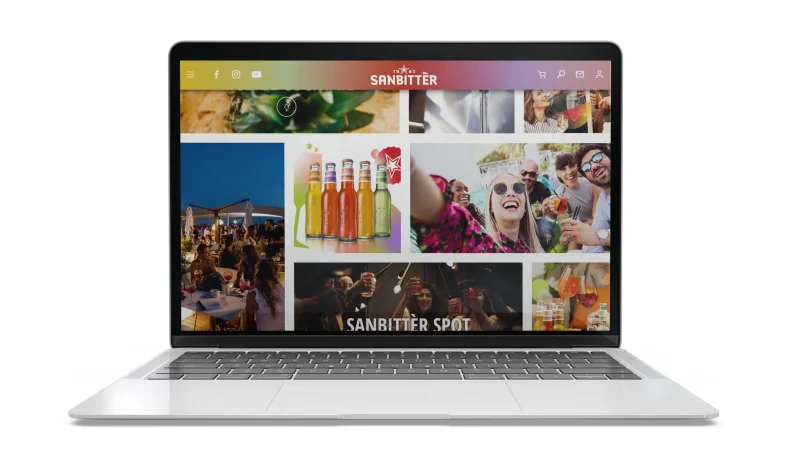
The project consisted in the Sanbittèr visual identity system revamp, in order to bring coherence with the new communication claim. The channels for this brand are both the food retail chains and the on trade sector.
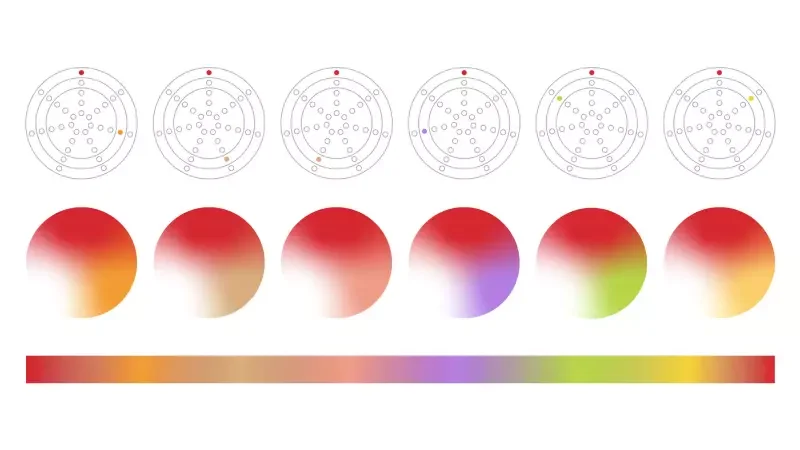
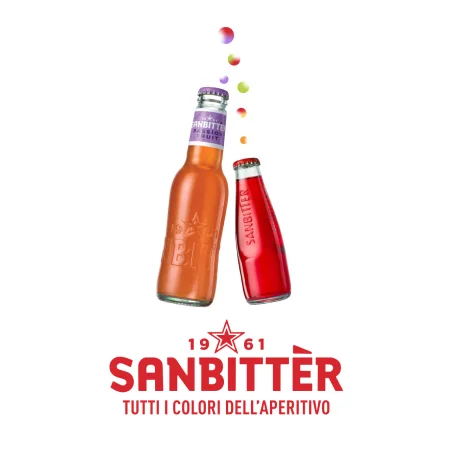
The fizziness has been identified as the main Sanbittèr brand identity differential and has been transformed into an imaginary dimension.
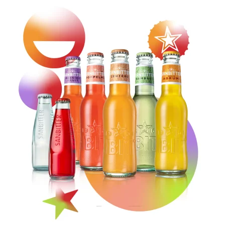
The sparklingness is interpreted by bubbles representing the cheerful and colorful Sanbittèr’s World.
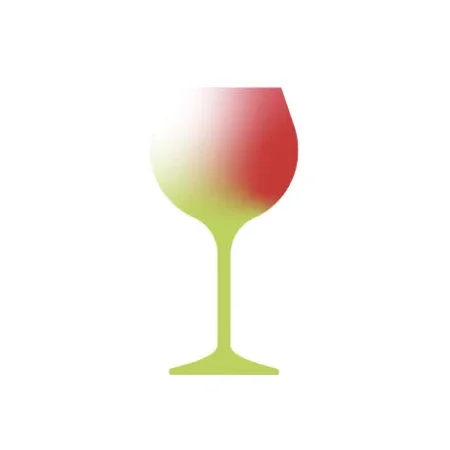
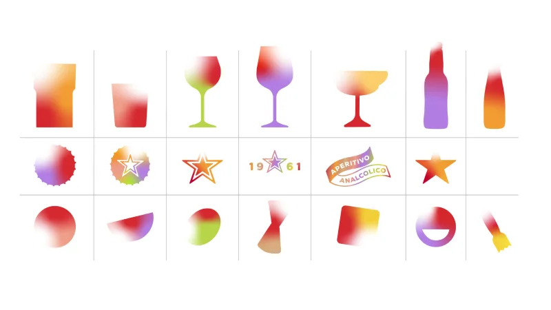

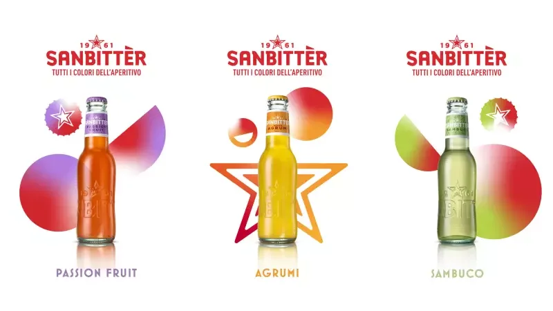
The visual set includes the silhouette of the most representative icons of mixability, to recall the different drinks of the Sanbittèr range and the many cocktails in which they may be key players.
The need to represent the chromatic palette of all the aperitif’s colors has been smartly settled by using a shade starting from red and developing through a different nuance depending on the SKU and the occasion.
The white background recovery helps highlight both the peculiar color palette of this system and the visual artwork.